Since founding 4aGoodCause (4aGC) in 1998, I have seen my fair share of donation pages — both good and bad.
After building hundreds of nonprofit websites, there are certain donation page elements I’ve found that prove successful in driving the most donations, starting with the headline.
Many times, potential donors will visit your donation page to check it out; they might even hover the mouse over the “donate now” button, but end up leaving the page.
How can you increase your online giving conversion rate?
It comes down to quality content and great page layouts, starting with your headline.
Before we dive into the how of writing great donation page headlines, let’s start with why it matters so much.
Why headlines matter for your nonprofit
A headline isn’t just a line of text — it’s the spark that draws someone in and frames their entire giving experience.
To truly understand its power, we need to look at why donation page headlines are crucial to get right (and what makes a headline resonate):
Learn how to raise more and stress less with trusted techniques.
The Psychology of a Good Headline
Your headline is the first thing a potential donor sees. (And essentially, if you read no other part of this section, that’s why they’re so important.)
Headlines are your visitor’s (and potential donor’s) first impression. A strong headline builds trust, creates urgency, and frames the giving experience in a way that resonates with your donors.
They should evoke a sense of urgency to grab the audience’s attention by making them realize this is not a page to bookmark and look at later.
And headlines that show social proof or highlight the impact on real beneficiaries are proven to optimize conversions. This helps donors visualize the difference others have made and the powerful impact they can have on real lives.
Impact on Metrics
A strong headline can significantly boost click-through rates on a landing page, increase donation conversions, and even raise average gift amounts.
It’s often the deciding factor between a visitor scrolling past or choosing to give.
A/B testing can be used to compare headlines to see which drives more donations and higher giving.
So by tracking which version gets more clicks or higher gift amounts, you can learn what messaging resonates best with your audience.
Even small tweaks can lead to measurable, lasting improvements in your fundraising performance.
SEO Benefit
A keyword-optimized headline doesn’t just attract readers — it can play a small-but-important part in getting your page to rank higher in search engines.
Clear, relevant headlines also improve visibility when shared on social media, making it easier for new supporters to quickly understand and engage with your cause.
Funnel Potential Donors into a Monthly Giving Program
In just a few words, a good headline can make the difference between a one-time donation and a recurring gift on nonprofit donation pages.
A strong headline clearly communicates why giving — especially through monthly donations — makes a lasting impact.
While one-time donations are valuable, recurring donations provide reliable, long-term support that helps your nonprofit plan ahead and serve more people more effectively.
And the right headline guides visitors toward that deeper commitment by making the case for becoming a monthly donor right away.
And if you haven’t started a monthly giving program yet? It’s time! According to the M+R 2025 Benchmark Study, revenue from monthly givers increased by 5% and accounted for 31% of all online revenue. That’s huge!
After 4aGC: We had ability to customize event landing pages matched to our look and feel; to sell multiple levels of tickets and add-ons; and to capture additional info through custom questions — which vastly improved the experience for our supporters.
Kelly Schwartz
Signature Events Manager at MANNA FoodBank
Once you’ve captured attention, the next step is to turn generosity into sustained support.
Let’s talk through how the structure of your page can guide that journey — starting with the headline.
Fundraising software that feels like part of your team. Try 4aGoodCause and experience partnership—not just a platform.
Now that you know why headlines matter, there are a few other things that you need to keep in mind when it comes to grabbing the attention of potential donors:
The second thing people notice when they visit a webpage, after the initial headline, are the visuals. On your donation page, less is more.
Find one powerful image, of your own or a (not-so-cheesy) stock photo, to have on the page. Use that picture to capture and communicate who you are and what you do.
Clean donation page
If you haven’t noticed yet, less is more is the key lesson of this blog post.
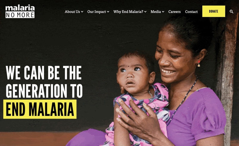
If you look at Malaria No More’s homepage, you’ll probably notice it’s busy; there are a lot of elements and pictures.
And notice the difference between the two headlines.
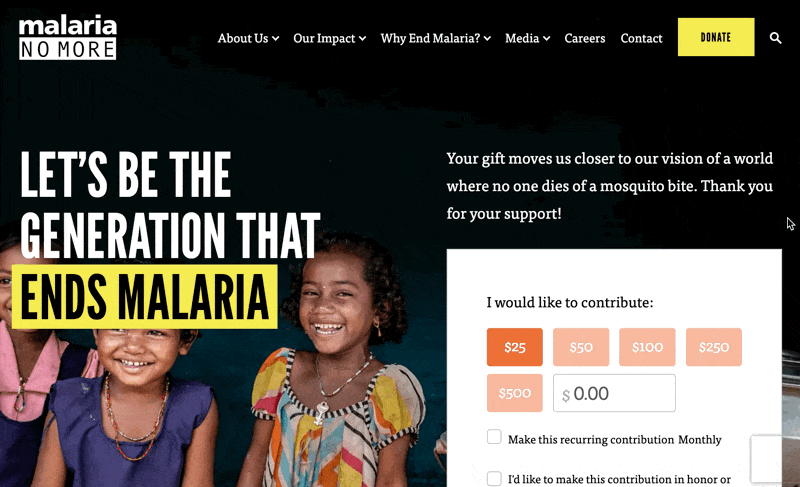
Malaria No More Donation Page
The donation page is still well branded and has powerfully written content, but it is the opposite of busy.
It is clean and uses white space to lead the eye to what is important: the donation form.
Also, the two headlines differ.
The homepage headline is “We Can Be The Generation To End Malaria”
The donation page headline is “Let’s Be the Generation that Ends Malaria”
Branding is key – branded donation pages garner 6 times the amount of donations over generic donation pages. And the shift in the headline language in this particular example is intentional: The donation page headline invites potential donors to be a part of the solution.
Overall, keep the design clean, consistent, and always have a clear donation button.
Emotional content
You don’t want to write a lot on your donation page because you don’t want your potential donors to get distracted, but what you do write after the initial headline needs to tug at the heartstrings.
In two paragraphs or less, your page copy:
Needs to be motivating
Needs to show people that you are making a difference with their contributions
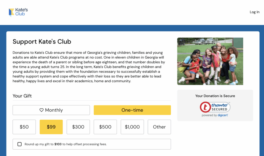
Our client, Kate’s Club, does a great job of making people feel a lot toward their cause in only a few words.
Kate's Club Donation Page
One call-to-action
Speaking of few words, your donation page should have a single call-to-action.
Create a “Support us” section on your website so you can have one page for donations and one page for volunteers — you don’t want to overwhelm donors with options.
When they get to your donation page all you want them to see is “Donate now,” not “Donate or volunteer now.”
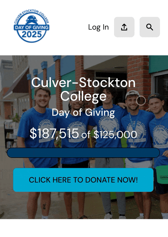
Check out this example from 4aGC client Culver-Stockton College. With strategic priming of their donor audience through an outreach campaign, they had a 66% donation conversion rate via this landing page.
More nonprofit website traffic is coming from mobile devices. According to the M+R 2025 Benchmark Study, mobile users represented 53% of all nonprofit website visits, with 47% of traffic from users on desktop.
Of course, this means it’s imperative that your donation pages are built for donors who are on the go.
Your prospects are checking you out via their smartphones, tablets and desktops. Be sure to have a responsive donation page (and website) that is mobile-friendly.
Now, with structure and performance tips for your donation page in place, let’s get inspired by real headline examples.
Donation page headline examples & templates
With the right structure in place, it’s time to refine your message.
These headline tools and templates can help you brainstorm copy that moves people to give!
Check out these free tools to craft powerful headlines:
CoSchedule Headline Analyzer: A tool that helps you craft headlines that boost traffic, engagement, and SEO performance. It provides a headline score, keyword suggestions, and tailored tips to optimize your headlines for various platforms and purposes. Try it here.
Free AI Headline Generator from Hubspot: A free, AI-powered tool that generates creative headlines for landing pages and digital ads based on your inputs and core keywords, making it easy to find fresh inspiration for your donation pages. Test it out.
Easy-Peasy.ai’s Headline Generator: A user-friendly online tool that sparks creativity by helping you brainstorm catchy headlines. Plus, it’s free. Check it out.
Use the tools above to get you started on ideas when you feel stuck, but here are a few simple headline templates for nonprofits specifically to help get you going:
“Make a real difference for [cause]—give [amount] today.”
“Join [number] supporters in changing lives—give [amount] now.”
“Together, we can [impact statement]—support with [amount].”
ChatGPT prompts to generate donation page headline ideas
And if you’re a fan of using LLM chat tools like ChatGPT or Claude.ai?
Here are some of my favorite AI prompts or ChatGPT prompts for good headline ideas. (Feel free to steal these and modify them for your own use!)
Generate 10 emotionally powerful headlines for a donation page supporting [cause/organization]. Focus on urgency and impact.
Generate 5 headlines templates with placeholders for cause, amount, and create several CTAs.
Write 3 versions of a headline for a donation page that create urgency, such as using time-sensitive language.
Suggest A/B test headline pairs for a donation page: one emotional, one data-driven.
Donation page content writer (free AI tool)
Generate powerful, donor-ready headlines and appeals for your nonprofit’s donation page with this free AI fundraising copywriter.
For more inspiration, explore these donation page examples:
Donation page templates: make things easy on you and your team
You could simplify the whole process by using donation page templates that are built with fundraising best practices in mind.
That way, you can spend less time nit-picking format and copy and stay focused on what matters: your fundraising goals.
4aGoodCause offers professionally designed donation page templates that make it incredibly easy for you and your team to create effective, high-converting pages.
Whether you’re launching a new campaign or improving your existing fundraising strategy, 4aGC templates save time while ensuring your message is clear, compelling, and optimized for giving.
(And they take only a few minutes to create.)
Raise more with less effort—our fundraising platform makes it simple.
4aGC removes the guesswork by providing layout and content structures proven to support stronger fundraising efforts.
Plus, the templates are:
Mobile-responsive
Brandable
Can integrate with key fundraising tools
Measurable – 4aGC tracks progress seamlessly.
With 4aGoodCause, your team can focus more on building relationships and less on page design.
“
4aGoodCause is an excellent resource for non-profits who wish to maximize their fundraising campaign efforts and minimize the technical work of website landing pages, online payment systems, and donor record keeping.
Jonathan Klein
Director of Music, St Gregory the Great Episcopal Church
Templates and tools do make it easier for your team to take the next step — but your headline is just one part of the equation.
Supporting your headline: page elements checklist
It’s not just about a good headline. That’s just step 1.
Even the best lead (ie, your headline here) needs a strong supporting cast.
Powerful Visuals & Layout
Use one strong hero image showing beneficiaries in action. Ensure your page is mobile-friendly and fully responsive for all devices.
Clean Donation Form
Keep it simple—limit form fields and offer popular payment options like credit cards and PayPal. Use clear labels for donations and suggested donation amounts. The giving process should be easy.
Single, Clear Call to Action
Focus on one bold button such as “Donate Now” or “Give Now.” Avoid clutter by separating donation CTAs from volunteer or event actions.
Emotional & Social Proof Copy
Use short, impactful paragraphs featuring beneficiary stories, matching gift opportunities, and clear statements of your impact.
Mobile Responsiveness & Testing
Make sure your page is responsive across mobile devices for positive donor experiences. Use A/B testing on different devices to optimize performance, following nonprofit website best practices like those in the M+R 2025 Benchmark Study.
“
The ‘marriage’ between our special event/donor pages and 4aGoodCause has provided our participants and donors an easy and user friendly product
Dawn Blankinship
Big Brothers Big Sisters of Central Virginia
When all parts of your page support your message, donors feel confident giving. But how can you keep improving over time? Let’s move into optimization.
Advanced optimization strategies
Take your page to the next level with data-driven testing and marketing integrations that help you continually improve.
A/B testing your headline & CTA
Try testing different headlines and CTAs to see what works best. You can also test popups and track results to learn what gets more clicks or donations. For example, try a headline with urgency (“Give Now”) vs. one with impact (“Change a Life”).
Templates & systemization
Create basic templates for your website’s header and footer to keep things consistent. Use different pages for different goals—like a general homepage vs. a special year-end or monthly giving page.
Integrating with marketing channels
Make short, shareable posts for social media to bring people to your donation page—LinkedIn can work well. Use emails or mail to follow up, repeat your headline message, and always include a donation link or phone number.
Testing and refining your page ensures it continues to perform. Now, let’s pull everything together with a quick summary of donation page best practices.
⭐️ Ready for consistent donations with less hassle?Monthly givers have a 83.6% average retention rate. Discover how 4aGoodCause helps you build a loyal base of recurring donors who are passionate about your cause.
See how much you could raise!
How much can you earn?
$
Total raised for your organization
Putting it all together: donation page best practices checklist
Let’s wrap it all up. As a quick review, these are the minimum elements needed to make sure your donation page and headline is ready to go:
Focus on impact ✔
Emotional appeal ✔
Make it responsive ✔
Clear call to action ✔
A/B testing & optimize for SEO and social sharing ✔
Align with your fundraising goals ✔
Use this final checklist to make sure your donation page is optimized for real results—starting with the headline and ending with a seamless giving experience.
I also have a comprehensive donation page audit checklist (it’s free!) that I’ve built over my 25+ years of working with nonprofits. Get the checklist here to walk through it yourself:
Or, you can schedule a meeting with me and I can go through the audit checklist with you (for free!) to help you determine where to improve your donation pages: Book a demo.
“
Thanks to 4aGoodCause, we were able to focus on inspiring our community to give, knowing we had the right tools in place to make it happen.
Sara Dyckman
Office Manager, Yeshivat Netivot Montessori
With all the elements aligned, you’re ready to create a donation page that converts.
But if you want to make the process even easier — and more effective — I’ve got one more suggestion.
Create great donation pages with 4aGoodCause
If you want to put all of this into action with less stress and better results, 4aGoodCause is here for you.
Whether you’re refining your donation page or planning your next big campaign, we believe every nonprofit deserves the tools to turn visits into meaningful gifts.
That’s why we focus on the simple but powerful elements: strong headlines, clean design, and smart testing strategies that help you connect with donors and increase conversions.
Need a fresh perspective? The 4aGC donation page audit checklist can help you spot what’s working, what’s not, and where small changes can lead to big results.
Ronald is the President and Founder of 4aGoodCause, the fundraising CRM that makes recurring, monthly giving a breeze for small nonprofits.
For over 25 years, Ronald has had the joy of doing what he loves, building online solutions that make a difference in the world. He’s helped raise millions of dollars online for small nonprofits across the country. Connect with Ronald on LinkedIn.
Grow your monthly giving program with our resources