Recurring monthly donations are increasingly becoming crucial to sustaining the operations of small nonprofits. By committing to a monthly donation, supporters provide a reliable and predictable source of funding that allows these grassroots organizations to plan and execute their programs effectively. This steady stream of income enables nonprofits to focus on their mission, rather than constantly worrying about fundraising.
Enrolling donors online in your monthly giving program presents a number of challenges that organizations must address in order to maximize their success. Nonprofits must stand out among the many other organizations that are competing for donors’ attention and dollars.
Additionally, organizations must find ways to effectively communicate the impact of monthly donations and make it easy for donors to set up recurring payments. By addressing these challenges, organizations can increase the number of monthly givers they acquire online and build a strong, sustainable base of support for their mission.
In this blog post, we’ll walk you through the steps to meet these challenges and enroll more recurring donors online:
- Understanding monthly givers
- Target potential recurring givers with the right message
- Optimize your website for online donations
- Make it easy to give with a great donation page
- Optimize that page for monthly donations
- Drive traffic to your donation page from all channels
Understanding monthly givers
Let’s start by looking at who you should be targeting for a monthly donation.
Why do donors give monthly?
Monthly giving is a popular way for people to support their favorite charities. The reason why people become monthly givers is simple: they want to make a lasting impact. By giving monthly, donors can provide ongoing support to the causes they care about. Monthly giving also simplifies the donation process and makes it easier for donors to budget their charitable giving.
Many charities offer special benefits and recognition to their monthly donors, such as exclusive updates and invitations to events. Becoming a monthly giver is a convenient and impactful way for individuals to support the causes they are passionate about.
How much do monthly donors give?
The average monthly donation amount from recurring donors varies significantly based on the cause and organization. On average, donors give between $20 to $50 per month. However, some donors may give as little as $5 per month, while others may donate upwards of $1,000 per month.
On 4aGoodCause our average monthly donor gives $63/month. It’s important to note that every contribution, no matter the size, is meaningful and can make a significant impact on the organization’s ability to fulfill its mission and provide vital services to those in need.
How long do monthly givers stay active?
Monthly donors typically stay active for an extended period, often measured in years. Research indicates that the average retention period for monthly donors is around five to seven years. However, it’s crucial to note that some donors may remain active for much longer or shorter periods, depending on various factors, such as their level of engagement with the organization and their financial situation.
It’s essential to maintain regular communication with monthly donors and show them the impact of their contributions to increase their retention rate over time.
What is the lifetime value of a monthly donor?
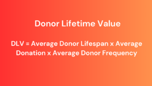
Lifetime value (LTV) is a measure of the amount of money you anticipate a supporter will donate to your organization over the course of their giving relationship. The calculation considers both the length of time the supporter remains involved with your nonprofit and how often they make contributions. When a supporter donates on a frequent basis, they become more valuable to your organization.
Let’s take the average monthly donor on 4aGoodCause as an example. If that $63/month donor stays active for all seven years the lifetime value would be $5292. That’s a lot of money for a small nonprofit. And this doesn’t take into account if this monthly donor gives the occasional supplemental one-time gift or makes a legacy gift which certainly does happen.
How can you identify potential monthly givers in your database?
To find monthly givers, you should start by analyzing your existing donor database. Your past donors already support your mission and have shown a willingness to turn that support into donations. Monthly donors are often culled from past donors who have:
- given multiple times within a year
- use a credit card or other electronic method to give
- given in smaller amounts (typically less than $100)
Brand new donors that make a small one-time gift are also good to target. Why not make the follow-up solicitation for a second gift an ask for a recurring monthly donation?
Target potential recurring donors with the right message
Convincing someone to commit to a recurring donation only occurs when you present the message that communicates the benefit of that donation to both the donor and your cause.
Here are some strategies to consider in crafting your recurring donation pitch:
Show the impact of monthly giving
Many donors appreciate the convenience of making a one-time online donation, but they may not realize that monthly giving can have a greater impact. Explain how their monthly gift can help your organization plan and budget more effectively, and how it can provide a more stable source of support. For best results, tie the amount of their recurring gift directly to the impact it will make.
Highlight the convenience of monthly giving
Remind donors of the ease of giving automatically in small amounts every month. Donors are used to subscription services like Netflix and Spotify. Your cause is another subscription service they can enroll in, one that will do good in your community.
Showcase your organization’s accomplishments
Donors want to feel like their contributions are making a difference. Share stories and statistics that demonstrate how your organization is making a positive impact. If donors can see the results of their gifts, they may be more likely to commit to giving monthly.
Provide exclusive benefits
Consider offering exclusive benefits to donors who make monthly gifts. This could be anything from a special newsletter or updates on your organization’s progress to early access to special events or opportunities to meet with staff or volunteers. These benefits can help donors feel appreciated and valued, which can encourage them to continue giving.
Be transparent
Donors want to know how their gifts are being used. Be transparent about your organization’s finances and how donations are being used to support your mission. This can help build trust and confidence in your organization, which can encourage donors to give more frequently and generously.
By implementing these strategies, you can help convince donors to give monthly and build a reliable source of funding for your non-profit organization.
Optimize your website for online donations
Next, let’s focus on getting your digital house in order.
The content and design of your nonprofit’s website should be focused on encouraging your visitors to take action. There are many actions you might want a website visitor to take such as signing up to be a volunteer or subscribing to your email list but let’s focus on the journey your website visitors take to becoming an online donor and how to encourage that action. Your goal should be to convert them from a visitor to a recurring donor and your website should support that goal.
Potential donors visit your website because they are interested in learning more about your organization and how their contribution can make a difference. They want to understand the impact that their donation can have and feel confident that their money is being used effectively. Your website serves as a platform to provide this information, build trust, and ultimately inspire individuals to donate to your cause.
How well are nonprofit websites converting?
The average nonprofit website has a 1% or less conversion rate. So, 99% or more of the people you get to visit your website leave without donating or taking any other action. These low rates represent an opportunity. By increasing your conversion rate to 1.5% or 2%, you would be getting 50%-100% more donors without adding any marketing budget.
Focusing on your conversion rate is one of the few things you can do that can truly multiply your results. On average, 33% of recurring donors are acquired online so you must have your website in shape to grow your monthly giving program.
What are the basics of a good website?
A good nonprofit website is an essential tool for building awareness, attracting supporters, and raising funds. But, what makes a good nonprofit website? Here are nine basic elements that are needed for any nonprofit raising money online.
1. Clear mission and vision statement
A clear and concise mission and vision statement is essential for any nonprofit website. It should be prominently displayed on the homepage and be easy to understand. This statement should be a summary of what the nonprofit does, why it exists, and what it hopes to achieve.
2. Compelling storytelling
Nonprofit websites should tell the story of their impact in a compelling way. The website should include real stories of people, places, or things that have been helped by the nonprofit. These stories should be accompanied by photos or videos that help to create an emotional connection with the reader.
3. Easy navigation
Navigation on a nonprofit website should be simple and easy to understand. Visitors to the website should be able to find what they’re looking for quickly and easily. The homepage should have a clear menu that leads to other pages on the site.
4. Mobile-friendly design
With so many people accessing websites on their mobile devices, it’s essential that a nonprofit website is mobile-friendly. This means that the website should be optimized for smaller screens, load quickly, and be easy to navigate on a mobile device.
5. Call-to-action buttons
Nonprofit websites should have clear call-to-action buttons that encourage visitors to take action. This could be making a donation, signing up to volunteer, or subscribing to a newsletter. These buttons should be prominently displayed on the homepage and throughout the website.
6. Donation page
A nonprofit website should have a dedicated donation page that makes it easy for visitors to give. This page should be easy to find from the homepage and should be optimized for conversions (see below). The donation page should be secure and have multiple payment options.
7. Social proof
Social proof is essential for building trust with potential supporters. A nonprofit website should include testimonials from donors, volunteers, and people who have been helped by the organization. This social proof can be displayed on the homepage, on a dedicated testimonials page or anywhere you want to emphasize to donors that they can join a community of like-minded supporters.
8. Clear contact information
A nonprofit website should have clear contact information, including phone numbers, email addresses, and physical addresses. This information should be easy to find on the homepage, and there should be multiple ways for visitors to get in touch with the organization.
9. Up-to-date content
A nonprofit website should be regularly updated with fresh content. This could include news updates, blog posts, or new success stories. Regularly updating the website shows that the organization is active and engaged.
For more tips on good website design check out our What you can learn from these 6 great nonprofit websites article.
Go beyond the basics by answering the questions donors have
Nonprofit websites that convert a lot of visitors into donors go beyond these basic website elements and focus their content and design on answering four important questions donors have before they decide to give online.
Why give (now)?
Your website will need to show the need for a donation. What is the issue your nonprofit is trying to solve? Why is that important to the visitor or his or her community? You can do this by dedicating a portion of your site to education that relates to your mission. Help the visitor understand what the issue is and that there is an urgency to the issue. The urgency is what makes the donor want to give before they leave the website.
Defining the problem on your website also helps you be found by potential donors. You’ll be using phrases and keywords that people will enter on Google, looking for information and answers on the topic. Your nonprofit becomes the authority on the issue.
And if visitors believe you are the authority then they are more likely to trust that your solution will work to tackle the problem. They then will be more likely to donate to your cause.
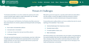
Here is an example from Chattahoochee River Keeper. This is a charity in Georgia that protects the Chattahoochee River. They have a simple section of their website called Our River which delivers basic facts about the river and shows the threats and challenges to keeping it clean. They also have a resource library with blog posts and other materials to inspire the need to protect the Chattahoochee River.
Why give to your nonprofit?
There are many charities donors can support. Your website needs to establish why your nonprofit should be the choice. To do that you are going to establish that you are a legit and trustworthy organization doing the right work to solve the issue.
First, build trust through the ‘about us’ section of your website. Many times, potential donors are using your website to get a sense of the organization’s personality and credibility. Do not be afraid to highlight those on your team. Donors want to know the real people doing the work.
That means:
- Use real pictures of leadership, staff, and board members
- Gather stories about why those in your organization enjoy the work they do
- Provide personal contact information
Be sure to provide testimonials of partners, sponsors, donors, program participants, or other resources in your network. This is social proof. If others support your nonprofit the website visitor will want to as well.
Root and Rebound is a nonprofit that works to help those reentering society after prison. They have a fantastic, dedicated “About Us” section on their website. There, you can meet their team. I love the welcome and the introduction of their team as advocates. Each team member has a great photo, profile, and best of all a testimonial as to why they work there or support the organization as a board member.
Each staff member shares their email address so you can contact them directly. These profiles make me trust this organization and make me want to be part of this team. become an advocate myself.

The second part of this is showing what you do to solve the issue. What programs do you have in place to impact the community you are serving?
Give specific details so that your donors get a true sense of and what you do. A mission statement that tells them “We provide educational opportunities for underserved communities” is fine, but how do you do that exactly? Use your website to spotlight the work you do and what makes your organization unique.
The goal is to show the website visitor that your nonprofit is the best choice for solving the problem you are tackling.
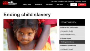
An example of a nonprofit doing a good job demonstrating the work they do is Anti-slavery, a charity in the United Kingdom working to end slavery. Visit their website and you’ll find a simple “what we do” section with simple pages that describe their work in various parts of the world. There are no fancy program names or internal jargon and they use a lot of images that show the work being done.
What will the impact of my (monthly) gift be?
You are showing them you are doing the work but is your work making a difference? Before a donor gives they want to know exactly how their dollars will be used. This is where you showcase your impact. Post stories of those that are affected by what your organization is doing.
Numbers are great, but showcasing your organization in a way that comes from those impacted is an even stronger way to connect with a potential donor. Donors give to help people, places, and things – not numbers. Tell the stories of the people, places, and things you help on your website.
Here is an example of what I mean. Donate Life NY is a nonprofit that seeks to increase organ donations. They humanize the impact of their work by sharing the stories of those affected by organ transplants. They have a dedicated section of their site just for this called Stories of Hope. A website visitor can understand that a donation can help create more “stories of hope”.

To specifically communicate the impact of a monthly gift I recommend creating a dedicated page on your website that spotlights your monthly giving program and how a recurring donation can impact your cause. This page should include the following content to maximize your success.
- Compelling headline: The headline is the first thing visitors see when they land on your monthly giving program landing page. It should be clear, concise, and compelling, highlighting the benefits of joining your monthly giving program. Use active voice and focus on the outcomes donors can expect from their gift, such as “Join Our Monthly Giving Program and Help Change Lives.”
- Program branding: Include the name and branding of your monthly giving program.
- Impactful stories: Using images that showcase the impact of your organization’s work can help create an emotional connection with visitors and encourage them to donate. Include photos or videos that show the impact of previous donations and how monthly giving can help sustain your organization’s work in the long term.
- Monthly giving program benefits: Clearly outline the benefits of joining your monthly giving program. This can include exclusive updates, behind-the-scenes content, or recognition for their ongoing support. The more compelling the benefits, the more likely visitors are to sign up.
- Donation levels: Give visitors the option to choose the amount they want to give each month. Offer multiple donation levels and clearly communicate what each level can help achieve. This provides visitors with a sense of control and helps them understand the impact of their donation.
- Social proof: Include testimonials from existing donors on why they give and why they recommend others support the program.
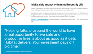
Habitat for Humanity has a dedicated monthly giving page on its website that uses testimonials and other content to demonstrate why a small monthly gift to Habitat can have a great impact on those they serve.
How do I give?
You’ve convinced the website visitor that you are worthy of their donation. They are ready to give. Now the website must show that person HOW to give. It must be obvious where to click to donate from wherever they are on the site.
This starts by having a clear, can’t-miss “donate” button near your top navigation. It should be available and easily seen on every page of your site. The Humane Society of Memphis and Shelby County accomplishes this with a bold red Donate button available all across their website.

In addition, you need to block out a section of your site that encourages donors to “get involved” or “support us”. This section will outline how to give or all the ways to give. It makes the case for why a gift is needed and should include a Donate Now button to your donation page.
Make sure you also sprinkle your donate button in places on your site where you can easily pivot to a donation ask. This could be from a blog article highlighting a story of someone or something your organization has helped.
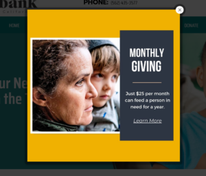
At the end of the year or during special campaigns feel free to deploy a pop-up on your home page that asks for a recurring monthly gift as in this example from The Foodbank of Southern California.
Make it easy to give with a great donation page
Once the donor clicks to donate you must close the sale with a great donation page.
Why donors abandon a donation form
Let’s say 100 potential donors visit your website and click to visit a page or form where they can make an online donation. How many of these 100 potential donors do you think will complete that process and submit the online donation? According to the M+R Benchmarks study the answer is only 21.
Particular sectors of the nonprofit community have even lower conversion rates – – such as only 14 out of 100 for hunger and poverty charities. The numbers can be even bleaker for nonprofits just using PayPal or other generic checkout carts – something that is not optimized or geared in any way for the nonprofit community.
So, why do these donors abandon their online gifts? It comes down to four factors.
- Confusion – The donor is confused and unsure whether they should donate. Perhaps the donation page doesn’t reinforce why a gift should be made. Perhaps the donor doesn’t understand who they are giving to or how their gift will help.
- Friction – There are roadblocks being put in the donor’s way to completing the donation. Perhaps the donation form is just too hard. There are too many fields for example or if the donor makes a mistake the page can’t help the donor correct it.
- Distraction: Something distracts them from completing the gift. There may be too many exit ramps off the page, too many links asking me to leave, begging me to abandon the gift.
- Fear: Something scares the donor away from making the gift. Is the page secure? Who are the people behind this charity? Will my money be wasted? Can I trust this organization?
The keys to a great online giving experience are similar to those for a good website.
- Simplicity
- Security
- Works on all devices
- Reinforces the reasons to give
If you want to acquire more online donations optimize your donation page using these 12 recommendations.
12 recommendations to help your donation page convert more gifts
1. Brand your page with your logo, brand colors, and consistent messaging that aligns with your website. Donors tend to give 38 percent larger gifts to branded donation pages.
2. Isolate your donation page from the main navigation components so that it functions as a landing page without any distracting links.
3. Design your page to be mobile-friendly and responsive to any device, as 55 percent of traffic (and growing) to donation pages is from mobile devices.
4. Ensure your page is trustworthy and secure with a fully encrypted security certificate and logo that reassures donors.
5. Make your page compelling by telling your story and showcasing your elevator pitch and Story of One to help donors understand the value of their gift.
6. Create urgency by explaining why their gift is needed now, using active language and phrases like “now” or “don’t wait.”
7. Keep the process concise by minimizing form fields and steps to reduce the risk of losing potential donors, as a complicated check-out process can cost up to 21 percent of potential donors.
8. Make sure your page is clear and easy to navigate with ample white space, appropriate headings, subheadings, and body copy.
9. Maximize donation amounts by giving donors options like monthly giving, covering processing fees, matching gifts, and suggested giving levels.
10. Be helpful by including contact information and error messages in plain language that easily show where errors are and how to fix them.
11. Show appreciation by automatically displaying a thank you message on the donation confirmation page and follow up with an automated email message that thanks the donor and provides additional information.
12. Amplify donors’ acts of kindness by adding social sharing buttons or automated actions after their donation processes, allowing them to share and spread awareness about your organization.
Learn more about great donation pages by watching our webinar, Get Set for Year-End Giving with Effective Donation Pages.
Optimize your donation page for monthly giving
To acquire the most recurring donors a good donation page is not enough. You must focus the donor’s attention on your monthly gift option. Design your donation form so a monthly donation is the most obvious and desired gift. Consider the following recurring gift configurations for your donation page:
1. Monthly is the default donation option. Show your nonprofit prefers a recurring gift by defaulting to that option. If you are running a special campaign to collect monthly donations then design a donation page where that is the only option.
2. Use icons or colors to entice the donor toward the monthly gift option. On 4aGoodCause, we place a small heart on the monthly giving option. This draws a donor’s eye to that option and entices more recurring gifts.
3. Make sure you offer suggested giving levels that pertain to a recurring gift. Donors want to know what a typical monthly gift is. A good monthly gift amount array is $10, $25, $35, $50, and $100.
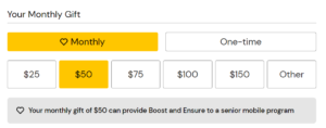
4. Consider pairing the suggested giving amounts with impact statements that help donors understand how their gift can make a difference. You are not telling donors exactly how you will spend their donation. You are simply explaining how they “can” make an impact on your community as in this example from the Open Cupboard donation page.
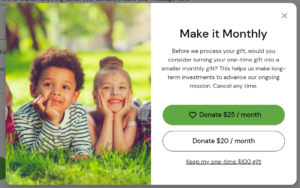
Didn’t convince the donor to go monthly? Offer them one more chance to make a monthly gift through an upsell pop-up. This is a small modal or window that will display if the donor chooses to checkout with a one-time gift. You can make an offer to the donor to “Make it Monthy’.
On 4aGoodCause, you can make this offer for one-time gifts between $5 and $500. We show two monthly gift offers with a spotlight on the bigger offer using color and a heart icon. The donor can switch to a monthly gift or they can continue with their one-time gift. Testing with Oxfam America and the League of Conservation Voters showed donors converted to monthly 2.5 to 9% of the time.
In the example below, Inter-Faith Food Shuttle offers a $100 one-time donor the opportunity to convert to a monthly gift at $25 or $20 per month.
Promote your monthly giving program through all channels
Got all the pieces in place? It’s time to drive traffic to your website or donation page from all the channels you use.
To attract online donors, you must guide them to your donation page. Don’t expect them to magically find it.
Here are 13 places to add a clear “Donate Now” link:
1. Home page spotlight: Set aside space on your home page for a specific call to give a monthly donation.
2. Website navigation: Place a prominent “Donate Now” button on your website navigation, ideally at the top right.
3. Website footer: A link to your donation form in your website’s header or footer will make it visible on every page of your website.
4. “Ways to Give” page: Include monthly giving as an option on your “ways to give” page.
5. Blog Articles: Place a Donate button at the end of articles that spotlight the impact of your programs.
6. Social media profiles: Add a custom tab or external link on your social media profiles that lead to your donation landing page.
7. Social media posts: If you’re running a fundraising campaign, include a shortened “Donate Now” link in your posts.
8. Email newsletter: Add an easy-to-find “Donate Now” button to your fundraising emails and newsletters.
9. Email signature: Create a standard “Donate Now” link that can be added to the email signature of each employee.
10. Confirmation pages and thank you emails: Encourage monthly donations online giving by including a link in your thank you messages to one-time donors.
11. Welcome series emails: Welcome brand new one-time donors to your nonprofit with a series of emails that cumulate in a monthly gift ask.
12. Direct mail letters: Include your donation page URL in the letters and newsletters you mail.
13. Event signage: Make it easy for donors to give at your events by posting your donation page URL and including a QR code or text message opt-in for mobile giving.
Bonus tip – When making a direct fundraising ask, always send the donor directly to your donation page. Don’t make them slog through your website to find out how to give.
You can do this!
As you work to acquire more recurring donors online, it’s important to remember that success won’t happen overnight. It takes time, effort, and patience to build a strong recurring donor base. However, by staying committed to the strategies outlined in this guide and continually optimizing your approach, you can achieve sustainable growth and impact for your cause.
Ready to acquire more monthly givers?
Are you ready to take your monthly giving program to the next level? Book a demo today to see how you can acquire more monthly givers and increase your nonprofit’s long-term fundraising success and retention goals. With the right tools and strategies, you can create a sustainable and reliable revenue stream for your organization.
