Working with nonprofit clients affords us the ability to view some amazing websites and landing page ideas. Last year, we gave you a list of 5 great nonprofit websites to showcase stand-out websites and provide ideas for inspiration. To follow up, we have 6 more nonprofit websites that stand out. Look below and read through the tips we suggest as takeaways from these effective nonprofit websites.
David Brower Center
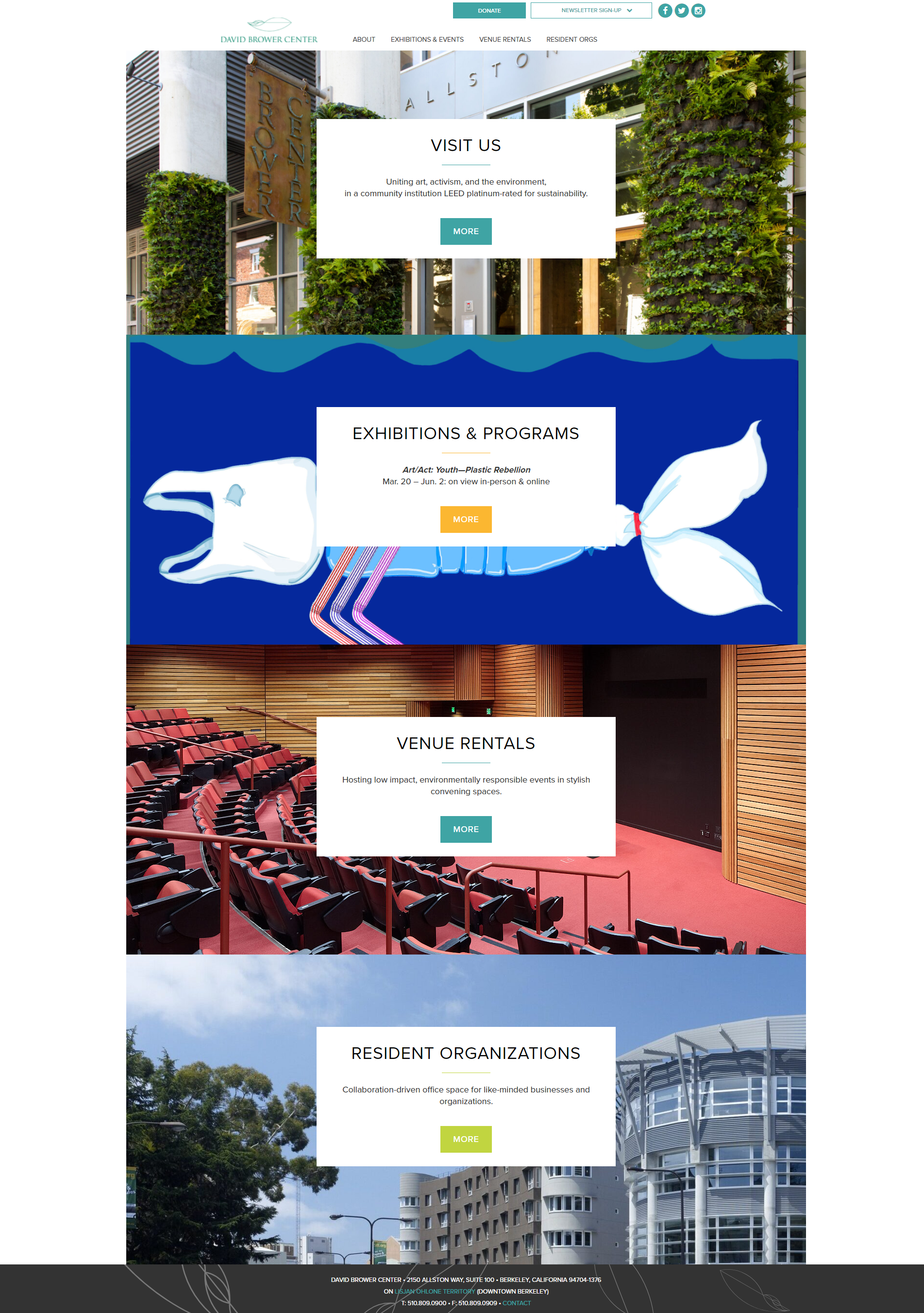
This website is all about explaining this nonprofit’s work. The simplicity of the home page provides four distinct ways to get involved – visit, view a program or exhibit, rent space for an event or be a part of their resident organizations. The exhibitions page on this site is full of imagery depicting people participating in and being a part of their events and exhibits.
Tips you can use:
- Be purposeful with CTAs on your home page; make it easy for visitors to understand the types of information they can get readily from your website
- Highlight program leaders and contributors with bios and imagery
- Take pictures throughout the year, for all programs and events, and use them throughout your website; this draws people in as they can “see” themselves in these events and in others on your site
Foothills Animal Shelter
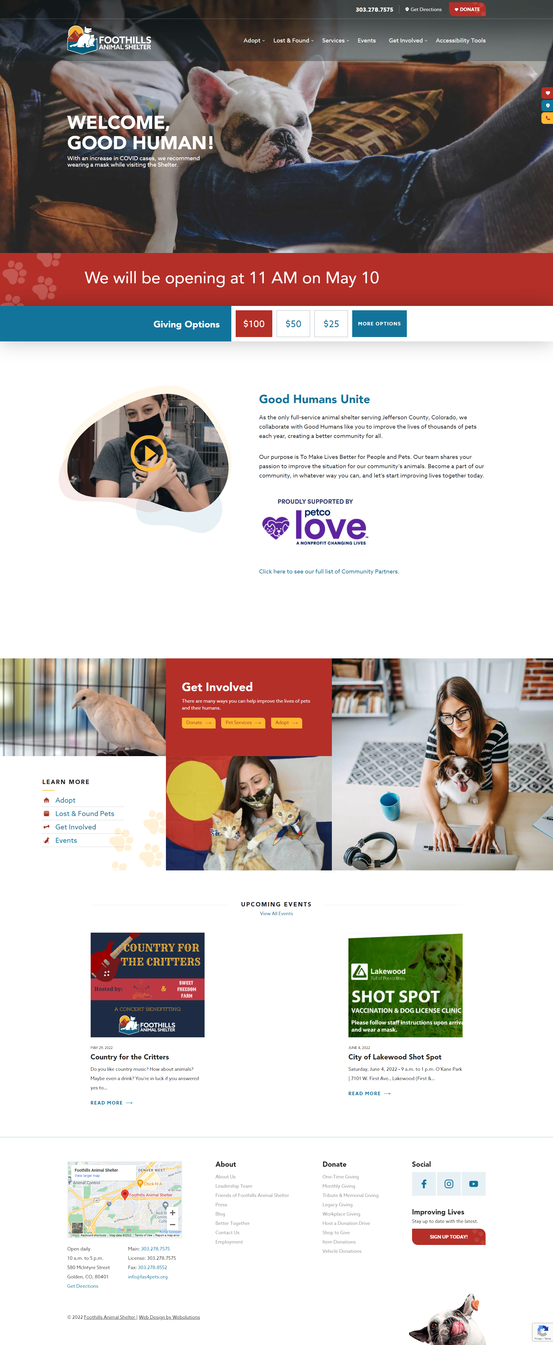
This site gets you right away with its great hero image, front and center. This organization has done a fabulous job of putting its hours or any closures right at the top of its home page under that adorable image. What’s more? The giving options are also right there—you can see them on the main area of the home page or via the red donate button at the top.
Tips you can use:
- Schedule a pop-up for the first time a user visits your page with a compelling image and short ‘why’ to donate. Pop-ups don’t have to be year-long; make them work for you during specific campaign times of the year
- Use white space and ‘pops’ of color. What makes this site so appealing is the way the color structure works with the CTAs and pertinent information on the home page
- Think accessibility. Foothills has a great option at the top of its site in the main navigation—if you click on “Accessibility Tools” myriad of icons appear at the top of the browser for users to have text recited, appear larger, change in color, etc.
Rainbow Village
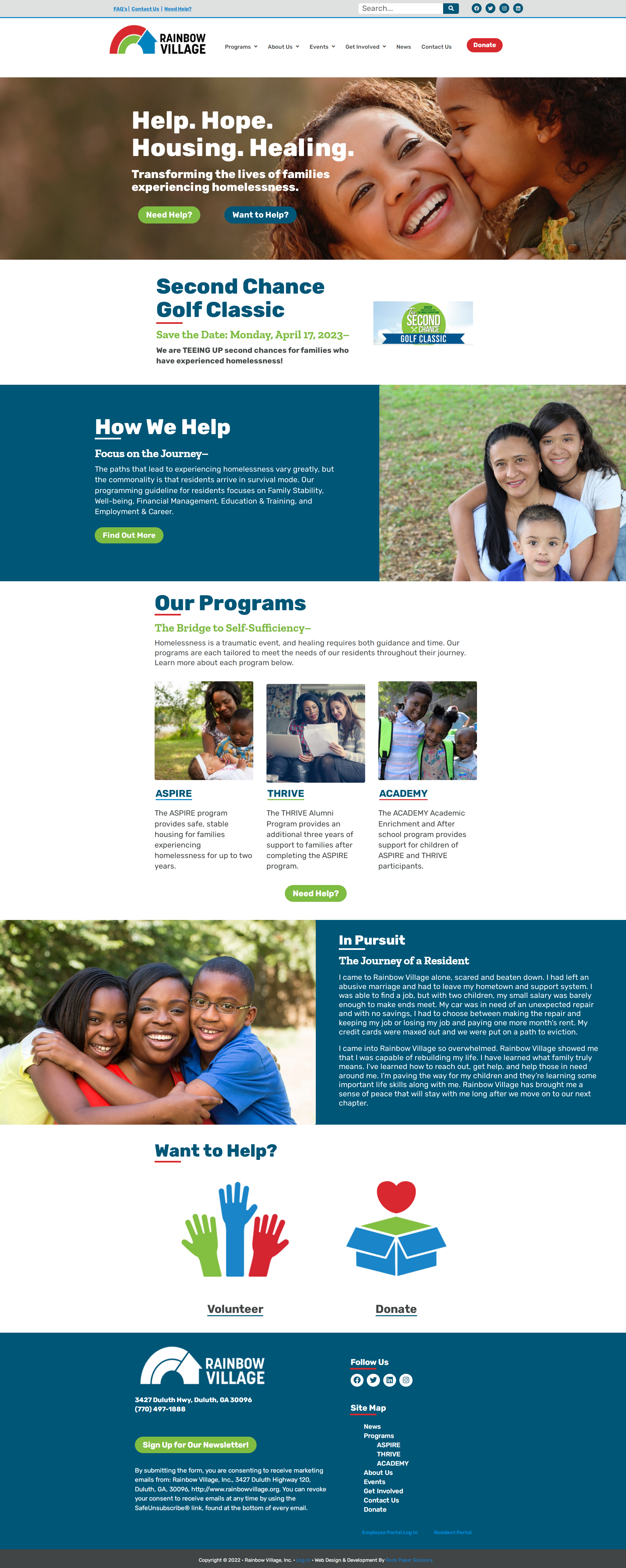
We love the use of bold colors and larger typography on this website. A simple, yet effective way to get the word out about how to get involved. Rainbow Village does a great job right on its hero image appealing to both types of audiences—those that may need their services and those that may be looking to help. This organization also does a great job of offering many giving options. Click on the “donate” button to see their monthly giving options along with its Women’s Giving Circle with multiple membership opportunities within.
Tips you can use:
- Provide multiple giving options and levels on your donation landing page; think about the best way to get everyone involved
- Utilize your brand colors for different call-outs or content block areas on your site. This is an easy way to chunk-out important content or areas you want visitors to see first
- Establish a news or blog section on your website. Rainbow Village does a great job of showcasing milestone events and impact stories on the news area of its site.
Root and Rebound

The minute you hop on the Root and Rebound website, you know who they are and what they do. It’s written right on the top hero image and invites you to learn more as a first action item. This strategy of drawing the visitors in by leading with a mission linked to the organization’s story is a great way to ensure everyone knows who you are. Even better is the organization’s transparency on its impact—on services, public education, policy and reach. The website does a great job and showcasing where the organization is today and what those impact numbers look like.
Tips you can use:
- Showcase your story as the first thing people see when they get to your website
- Calculate your impact and use those numbers across your website; this gives a visualization of how you are helping in the community
- Think interaction and key audiences. Root and Rebound offers a filtered option to view its website. When you click on the top right yellow square in the header, your options change to a filtered view of the site whether you “are an advocate” or “are impacted” by incarceration. What a great way to personalize their website!
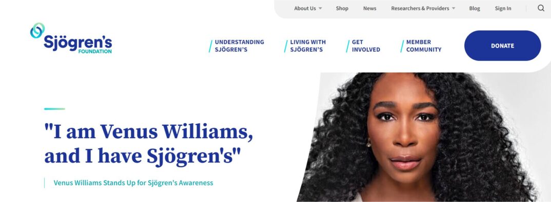
Sjögren’s Foundation
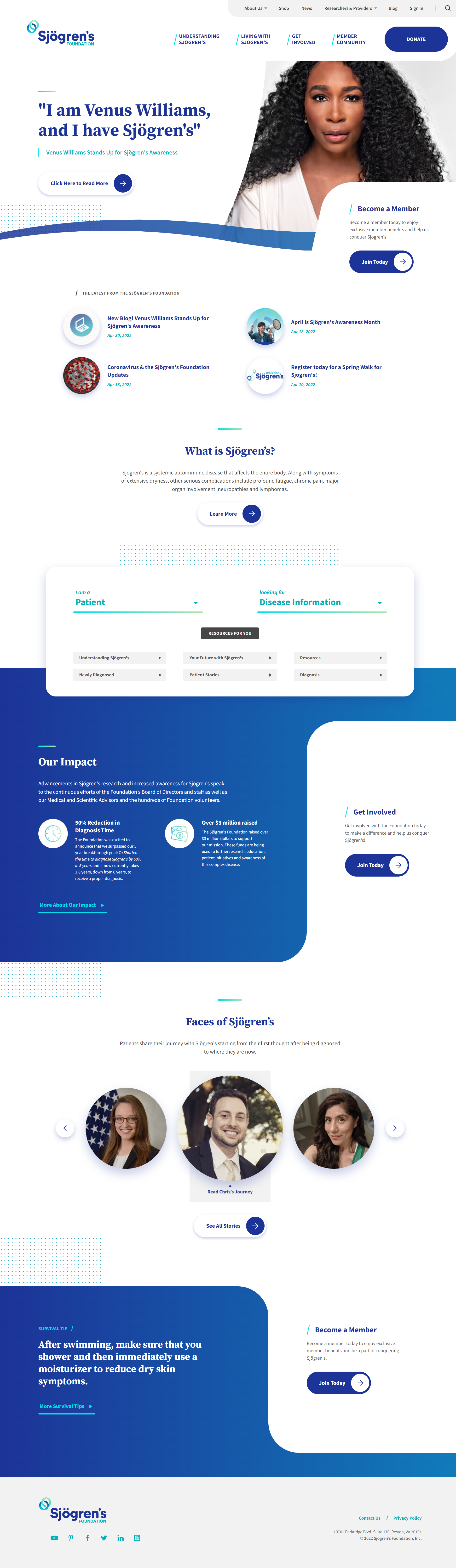
The layout on the home page of this website automatically draws you in. Great use of large CTA buttons/arrows and highlights of the most recent news and blog posts are right at the top of the home page. They have an extensive get involved section and content for various audiences. Hover over the “get involved” tab and you’re presented with 7 ways to be a part of the foundation.
Tips you can use:
- Provide many ways for visitors of your website to get involved outside of merely making a gift to your organization
- Think outside the box on your home page layout and design; how can you utilize branded colors, marks or secondary colors to make content blocks and key areas stand out?
- If you have a lot of information to relay and multiple audiences to reach, consider a main navigation area and sub-navigation area. Sjögren’s Foundation does a great job of using its main navigation header for pertinent information and a slightly small/less dominant secondary header for information that is still relevant, but not its main focus.
Stonewall Foundation
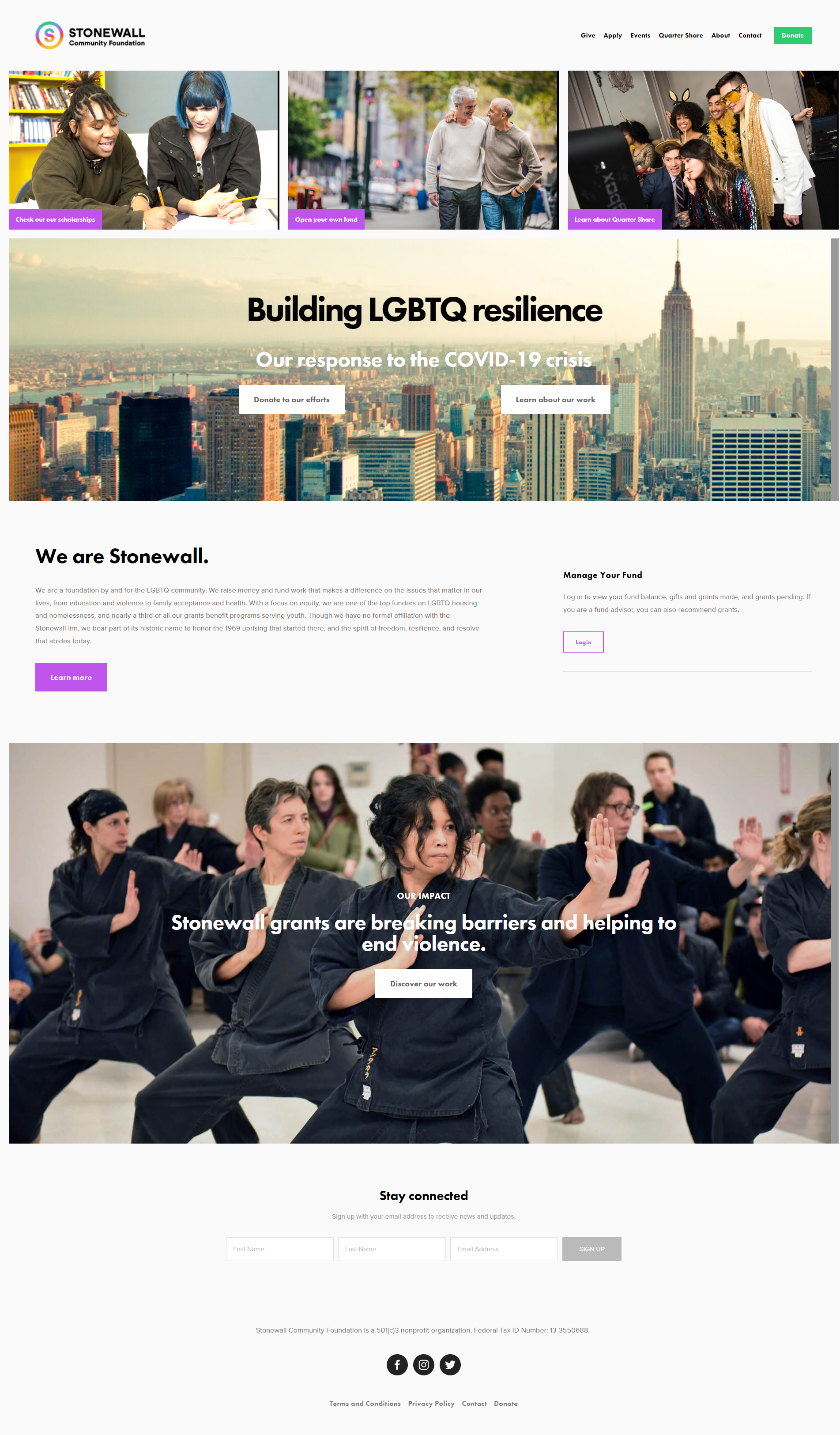
Another example of an organization that does a great job of using imagery to connect with visitors. This is also a new twist on how the hero image is set up on a website; notice the three image blocks above the hero image that call out specific actions? What a great way to lead the visitors to areas of the site where they can get involved right away or learn about specific programs.
Tips you can use:
- Provide multiple areas on your site for users to get to your donate page. Stonewall Foundation has it in the top navigation, in the hero image and as part of the CTA boxes at the top of the site
- Add an email list sign-up form on the homepage (and subsequent pages). Give website visitors a way to stay connected to you even if they aren’t making a donation or signing up for a program right away
- Showcase your team. Stonewall’s team page provides information not only about its staff and how to get a hold of them but about its board members as well
Every so often, look at the websites around you—competitors, places you like to shop online, magazine sites—and think about what draws you in as a user. How can you apply those changes to your nonprofit’s website? Keeping websites fresh will keep your fundraising fresh. Don’t be afraid to change things up occasionally and use others for inspiring examples.