What Should a Donation Page Say and Do: Frictionless Donation Pages
For every 100 potential donors who land on your online donation page, about 89 of them leave without giving. That’s not a website traffic problem… it’s a conversion problem.
So what does a giving page actually need to work?
Two things: the right words and the right experience.
I’ll walk you through both, step by step, so you can build (or refresh) your online giving experience that moves donors from “I’m thinking about giving” to “I just gave,”
At the end of this article, I’ve provided a ready-to-use checklist.
Here’s are the questions I’m answering (feel free to use these links to jump ahead):
Before we look at what a high-converting donation page should say and do, and explore nonprofit donation page best practices, it helps to understand what causes donors to leave in the first place.
📊 4aGoodCause by the numbers:Our donation pages convert at an average of 27% — more than double the industry benchmark of 11%. The best practices behind that performance are exactly what this guide covers.
Fundraising tools that work
Sign up to get our free Nonprofit Growth Kit—your roadmap to optimizing donation pages, impact stories, and recurring donors.
Why donors leave before giving (and what each problem means)
Before you optimize what your page says, it helps to understand what may be stopping donors from completing their gift.
Most donation abandonment comes down to four common roadblocks in the giving process: confusion, friction, distraction, and fear.
Confusion: If donors can’t quickly tell why they should give, where their money is going, or who the beneficiaries are, they’re likely to leave. Your copy should make those answers clear right away.
Friction: Too many form fields, too many steps, or unclear instructions can create hesitation. Good copy helps make the process feel simple and easy to complete.
Distraction: Navigation links, pop-ups, banners, and other competing elements can pull donors away before they finish giving. Your donation page should keep the focus on the gift.
Fear: Donors want to know the page is secure, the organization is trustworthy, and their gift will be used as promised. Clear messaging and trust signals help build confidence.
The rest of this guide helps remove these four roadblocks so more donors can follow through on their intent to give.
💡 Fun fact:A high-converting page starts with the basics: clear messaging, strong structure, and fewer roadblocks for donors. Read Why Donors Leave Donation Pages to see what helps donors follow through — and what gets in the way.
What should your donation page headline say?
Your headline should quickly answer one question: Why does this gift matter right now?
It should be clear, specific, and focused on the donor’s impact, not just your organization.
Action
Purpose
Example
Lead with impact
Show donors what their gift will help make possible.
What to avoid: Avoid generic headlines like Donate Today, Support Our Mission, or Give Now. They do not tell donors why the gift matters, why it is needed now, or what it will accomplish.
Try something like:Help provide emergency support for families in crisis
Once your headline draws donors in, your appeal copy should give them a clear reason to keep going.
Raise more with less effort.
This platform makes fundraising simple. Get an instant walk-through.
Think of your appeal copy as the point-of-sale moment.
A donor clicked through from your email or social media post for a fundraising campaign… and now they’re standing at the door to your donation form, perhaps after clicking a donation button. This is your last chance to remind them why they came.
Your donation page should include a short appeal above the form.
Keep the page focused, with no extra navigation or distractions pulling donors away, and use clear, concise copy that quickly explains why the gift matters and why it’s needed now.
Words like now and don’t wait can help create urgency, while clean formatting, white space, and clear headings make the page easier to complete.
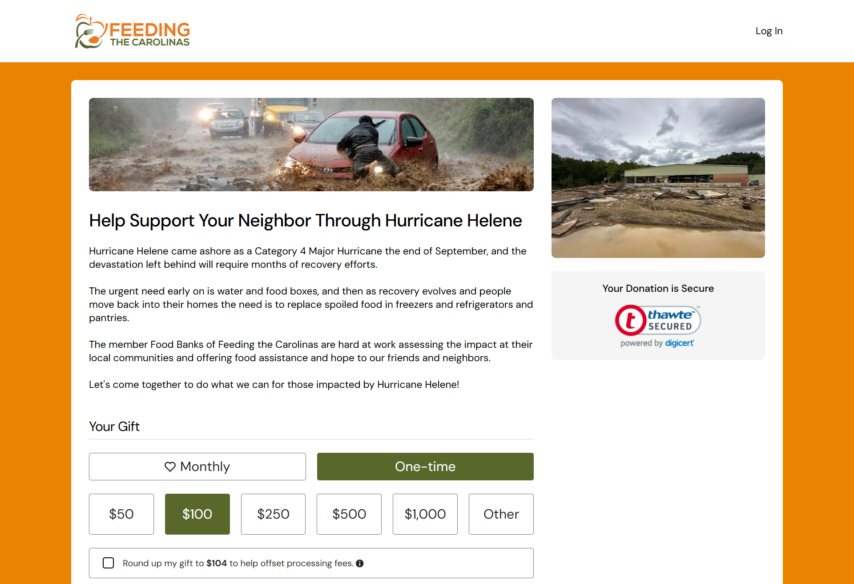
Feeding the Carolinas raising money for hurricane relief
Keep the message specific and donor-centered.
Focus on one person, one need, and what the gift will do.
For example: Right now, an animal in our care needs food, medical treatment, and a safe place to heal. Your gift today can help make that possible.
Once donors understand why the gift matters, the next step is helping them decide how to give.
“
Working with 4aGC has been incredibly easy. We’re a small nonprofit on a rapid growth trajectory, and as we’ve started hosting more events, the registration tool has proven intuitive and very manageable. With our limited budget, we’ve also found their pricing to be extremely affordable. I would highly recommend working with Ronald and his team.
Anne Krumme
Australian Wildlife Conservancy
What should the giving levels say and do?
Suggested giving levels, or donation amounts, should make giving easier and more meaningful.
I advise our clients to pair these with impact statements. Instead of listing only specific gift amounts, pair each one with a simple impact statement so donors can quickly see what their gift will do.
For example: $50 helps provide a week of meals for a family in crisis.
You can also maximize gifts by offering clear options like monthly giving, matching gifts, easy payment methods and the choice to cover processing fees.
Keep the choices clear and easy to act on, including payment options that help donors complete the gift quickly.
And make sure monthly giving is easy to see, not buried. That means having an easy to tap monthly giving option and features to encourage the monthly choice, such as a conversion offer.
4aGoodCause’s built-in monthly giving pop-up converts at 5% on average.
That’s 1 in 20 one-time donors becoming a recurring supporter (with zero extra effort from your team).
“
The average recurring donation on 4aGoodCause is $55/month, compared to $24/month industry-wide.
That’s not a marginal difference… it’s the kind of sustained revenue that changes how a small nonprofit plans its year and achieves its fundraising goals.
After the giving options are clear, the form itself should make it easy to follow through.
Only ask for what you truly need to process the gift, because every extra field creates another chance for a donor to leave.
Recently, The Baymard Institute reported that 18% of shoppers abandon checkout because the process feels too long or complicated, and Baymard also notes that the average checkout still shows far more fields than it ideally should.
With that in mind:
Keep it minimal: Ask for the essentials first: name, email, and payment information. Save extra questions for later.
Use clear, plain language: Your form should be easy to understand at a glance. Simple labels, helpful spacing, and clear headings make the process easier to complete.
Make optional fields feel optional: If you include extra choices, write them in a friendly way. Example: Instead of Tribute Gift, say Dedicate my donation in honor or memory of someone.
Frame fee coverage as a choice: Let donors decide if they want to add a little extra to cover processing fees, and explain what that means in a simple, respectful way. Example:Payment processing, like card and bank fees, reduces the amount our nonprofit receives. If you choose this option, your small extra gift helps cover those costs and lets more of your donation go to work.
Include matching gifts without adding friction: If an employer match is available, mention it right on the form with a short prompt. Example:See if your employer will match your donation.
Here’s a rule that will serve you well: Only ask for what you actually need to process the gift. Every extra field is a potential exit point.
Any error messages should help donors fix the problem quickly and keep going. Use simple, plain language that explains what happened and what to do next.
For example: If a donor enters the wrong zip code on the form, it could trigger the following:
The zip code submitted does not match the zip code that you have on account with your card-issuing bank. Be sure to compare the billing address you enter with the one listed on your credit card statement.
Clear, real-time guidance is much more helpful than a vague or technical error message.
It also helps to show donors that real people are available if they need help.
Adding a phone number or email address on the page can build trust and give someone a quick way to get an answer instead of leaving.
Just as important as clarity is reassurance that the page is safe, credible, and easy to trust.
“
With customizations for the messaging and the communication that we can now give to our current donors [with 4aGoodCause], not only are we going to see higher donor retention rates, but we're also going to see a better relationship with our donors.
Kelsi Cole
Foreknown Ministries
What should your donation page trust signals say and do?
Trust signals should reassure donors that your page is secure, your organization is legitimate, and their gift is going to the right place.
Keep that reassurance clear and visible with simple language like: Your donation is secure and encrypted. Your information is never shared.
It also helps when the donation page looks and feels like your organization all the way through. Our 4aGoodCause clients can brand their online donation form pages with their logo, images, and color scheme, which boosts trust signals with your donors: They know they’re giving to you.
If donors click “Donate” and suddenly land on a third-party branded checkout page, that can create doubt and interrupt the giving experience.
We also want to make sure the page works well on mobile devices, because mobile traffic matters. For 4aGoodCause, more than 60% of traffic to client donation pages comes from mobile.
A strong donation page builds trust before a donor reads much at all, even down to the choice of font. And that includes offering familiar payment options like Apple Pay, PayPal, and Google Pay when possible.
Once donors feel confident in the page, the next job is keeping their attention on the gift.
💡 Fun fact:All donor tips through 4aGoodCause go directly to your organization—not the platform. Learn what makes 4aGC different from other fundraising platforms.
“
We are a small nonprofit with minimal staff so a platform like 4aGoodCause has provided us with a professional, streamlined system for online donations. Our rep is amazing and always responsive when we have questions or need assistance.
Melanie R Carroll
Executive Director, Angel Flight SC
What should the page do to keep donors focused?
Your donation page should feel like a landing page, not a full nonprofit website page.
Remove the navigation, footer links, and anything else that gives donors another place to click.
Keep only what supports the gift: your branding, a short appeal, the form, and clear trust signals. The more focused the page is, the easier it is for donors to follow through.
Once the gift is complete, that’s the right time to invite donors to share. A simple prompt on the confirmation page can help extend your reach without interrupting the donation itself.
For example:Thanks for your gift. Want to share this campaign with a friend?
And once the gift is complete, the experience should keep working for you.
Join our newsletter and grab your free Nonprofit Growth Kit — real tools, real stories, and advice that actually works.
What should the confirmation page and thank-you say?
The confirmation page should do more than confirm the transaction. It should make donors feel good about what they just did and keep them connected to your mission.
Action
Purpose
Example
Start with a real thank-you
Skip the generic receipt language. Thank donors in a way that feels immediate and specific.
Thank you. Your gift will help provide safe shelter and support for families who need it most.
Reinforce the impact
Remind donors what their gift is helping make possible, not just that the payment went through.
You just helped [specific impact]. We're so glad you're with us.
Confirm the details
Let donors know the amount of their gift, where it is going, and what happens next, including their receipt or tax information.
We received your $100 gift to our Emergency Relief Fund. Your email receipt and tax information are on the way.
Invite donors to stay connected
This is a good place to offer a simple next step, like following your work or sharing the campaign with a friend.
Want to stay connected? Follow us for updates and stories of the impact you are making.
Use the page to build the next gift
If the donor made a one-time gift, you can gently introduce monthly giving after the donation is complete.
Want to make an even bigger impact? Consider becoming a monthly donor and supporting this work all year long.
Send a follow-up email right away
Your thank-you email should arrive within minutes, include the receipt, and keep the message short, warm, and impact-focused.
Subject: Thank you for your gift
Body: Thank you for your generosity today. You just helped [specific impact]. Your gift is already helping provide critical support to people who need it most. Your receipt is included below.
Thank monthly donors differently
Monthly donors made an ongoing commitment, a recurring gift, and your language should reflect that.
You've just joined a community of monthly supporters who make our work possible every single month.
The confirmation page is the most underused real estate in nonprofit online fundraising. Most organizations treat it like a receipt.
It’s actually one of the most powerful retention tools you have.
Taken together, these are the elements that make a donation page easier to complete and more likely to convert.
The frictionless donation page checklist: What to say and do before you publish
Use this before every new donation page goes live. It covers both dimensions:
The copy (what it says) and
The experience (what it does)
What it says (copy)
☐ Headline answers “why does my gift matter right now?” — not just “donate now”
☐ Appeal copy includes a Story of One: one person, one problem, one outcome
☐ Appeal copy answers: who needs help, why now, what will my gift do?
☐ Giving levels are labeled with real-world impact, not just dollar amounts
☐ Monthly giving option is visible and inviting — not buried
☐ Fee coverage ask is framed as a choice, not an obligation
☐ Form field labels are written in plain, friendly language
☐ Error messages are helpful and human — not technical
☐ Trust statement is explicit: security, encryption, where money goes
☐ Confirmation page thank-you is specific to the gift, not generic
☐ Monthly donor thank-you language acknowledges the ongoing commitment
What it does (UX + function)
☐ Branded: your logo, colors, and name throughout — including on the credit card statement
☐ Focused: no navigation, no footer links, one path forward
☐ Mobile-responsive: tested on a phone before launch
☐ Secure: SSL certificate visible, trust mark displayed on page
☐ Minimal form fields: only what’s needed to process the gift
☐ Real-time form validation: errors appear as the donor types, not after submit
☐ Contact info visible: phone or email for last-minute questions
☐ Confirmation page: gift confirmed, next steps clear, social sharing prompt included
☐ Automated thank-you email: queued and tested before launch
☐ Monthly giving pop-up or prompt: built in and active
With the right copy and the right experience in place, more donors can follow through on the intent they already had.
A better page helps you collect donations more consistently from the donors you are already reaching.
⭐️ Not sure what you need to improve your fundraising?We’re happy to take a look at your current setup and give you an honest opinion, even if that means pointing you somewhere else. Book a demo here.
A great donation page doesn’t happen by accident: It’s built with intention
The difference between a page that converts and one that doesn’t usually comes down to the same things: clarity, simplicity, and trust. Get those right (in your copy and in your experience) and you give more donors the confidence to follow through.
4aGoodCause donation pages come with nearly 100 best practices built in from day one, including customizable templates, which is part of why our clients see average conversion rates of 27% compared to the industry benchmark of 11%. But more than the platform, it’s the thinking behind the pages that matters… and now you have the framework.
If you want to see how this looks in practice (or if you’re ready to build pages that convert more of the donors you’re already reaching, with compelling donation page examples), we’d love to show you around.
Fundraising software that feels like part of your team.
Ronald is the President and Founder of 4aGoodCause, the fundraising CRM that makes recurring, monthly giving a breeze for small nonprofits.
For over 25 years, Ronald has had the joy of doing what he loves, building online solutions that make a difference in the world. He’s helped raise millions of dollars online for small nonprofits across the country. Connect with Ronald on LinkedIn.
Grow your monthly giving program with our resources