What is a fundraising landing page?
In short, a landing page is designed for the visitor to take a specific action. It drives content and link(s) around one specific topic (in this case, fundraising). Fundraising landing pages are different than regular website pages in that they remove other navigation features so that the user remains on the landing page and takes the action you desire.
Use 4aGoodCause for fundraising landing pages that convert
We have worked with hundreds of nonprofits over the years to provide tools that help them build landing pages that support and strengthen their fundraising campaigns. Now, we are excited to launch even more features to our fundraising landing page builder.
Our new feature offers a code-free landing page builder—no technical skills needed to create beautiful fundraising landing pages! For those of you who have struggled with other providers who offer limited customization abilities or only offer a generic donation form to take gifts, you will love the options within this new tool.
We’ve developed our new fundraising landing page tool with the following features in mind:
- Clean design
- Optimized for mobile
- Great visual options (images, video and more)
- Effective use of white space
- Simple forms
You can use our tool to easily build comprehensive pages that make the case for why gifts are needed or why someone should attend your next event. The builder also comes with a live preview screen so you can see your changes in real-time.
New landing page tool features
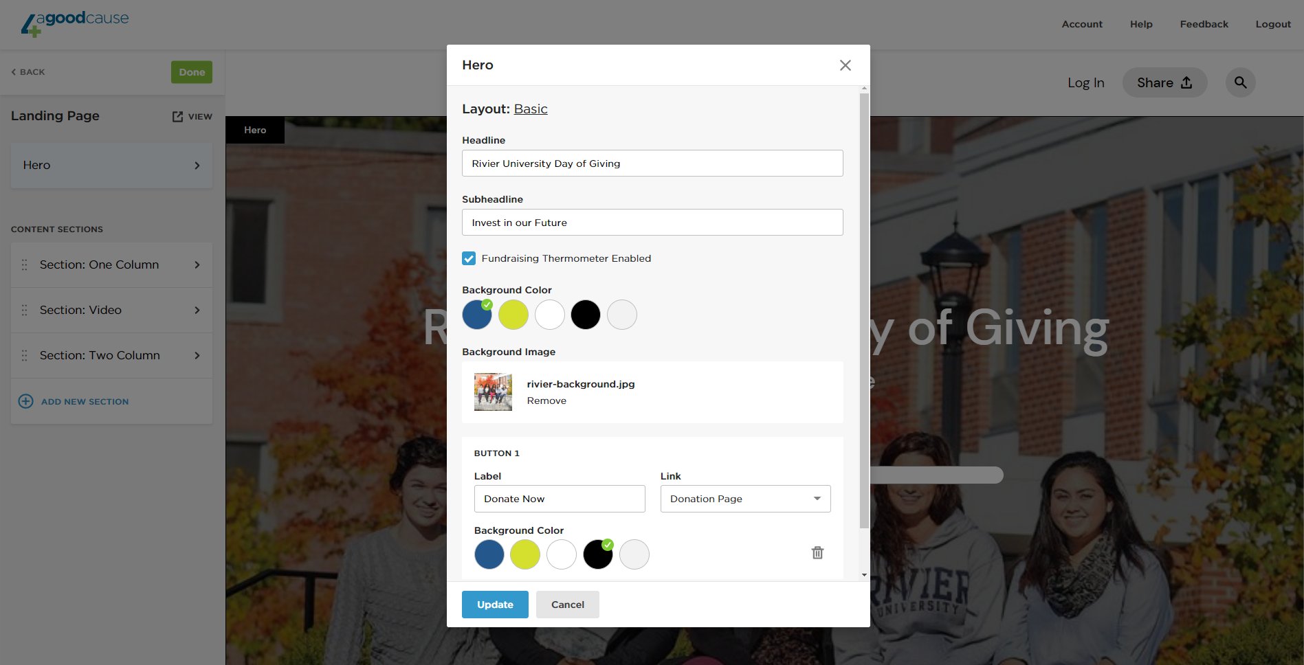
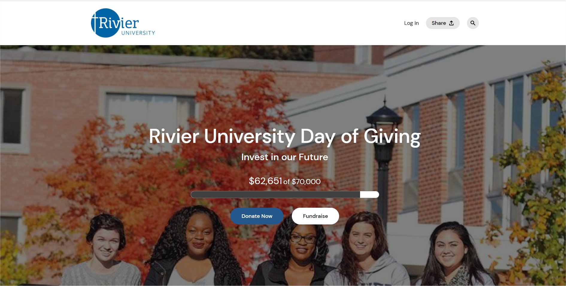
Each landing page consists of a hero section at the top of the page. Users can select from three layout options—basic, featured video, featured image— each with a variety of configuration options.
Under your hero area is where you can take customization to the next level with options to build up to six content sections of various types (including single column, two-column or video). Configurations in each section can include any of the following elements:
- Headlines
- Subheadings
- Custom background colors
- Custom background images
- Custom foreground images
- Fundraising progress thermometer
- Video embeds
- Regular text copy
- Call to action buttons that lead to our easy donation or registration pages
Each of these landing pages can also show campaign activity, P2P leaderboards and comments of support made by donors. A truly interactive experience.
Test and repeat
The great thing about our new tool is that you can play around with different layouts and configurations, see those changes in the preview area in real-time, and ask others for feedback. It’s a good rule of thumb to always test any landing page before it goes live. Ask those within and outside of your organization to do a test drive and provide feedback on what they like—what catches their attention? Does it make sense? Is the call to action clear? Are there any frustrations as they engage with the page?
In addition to our new landing page builder, we will be rolling out new design styles for other 4aGoodCause pages. Watch for these great design features and updates to donation pages, event registrations and P2P fundraising pages.
See it in action
We’d love to show you around our new tool; we know you’ll love the customization features and how easy it is to move and create these elements without needing to know any computer coding. Watch our free webinar, “How to build the ultimate fundraising landing page,” where we will walk participants through our code-free landing page builder to help you convert donations, event registrations and more for your next fundraising campaign. Learn how easy it is to build comprehensive fundraising pages that tell your story, provide an easy user experience, and convert.

