Sometimes all it takes is a little visual inspiration to conjure up your next big idea. We’ve offered advice on donation landing pages, how to optimize your website, and the importance of storytelling online to give your fundraising a boost. Today, we are taking our website tips one step further to provide you with five great examples of nonprofit websites.
Look at what these nonprofits are doing online to make their websites stand out and be inspired as you think about ways to improve your website. In no particular order, here are examples of five great nonprofit websites:
MySafe:LA
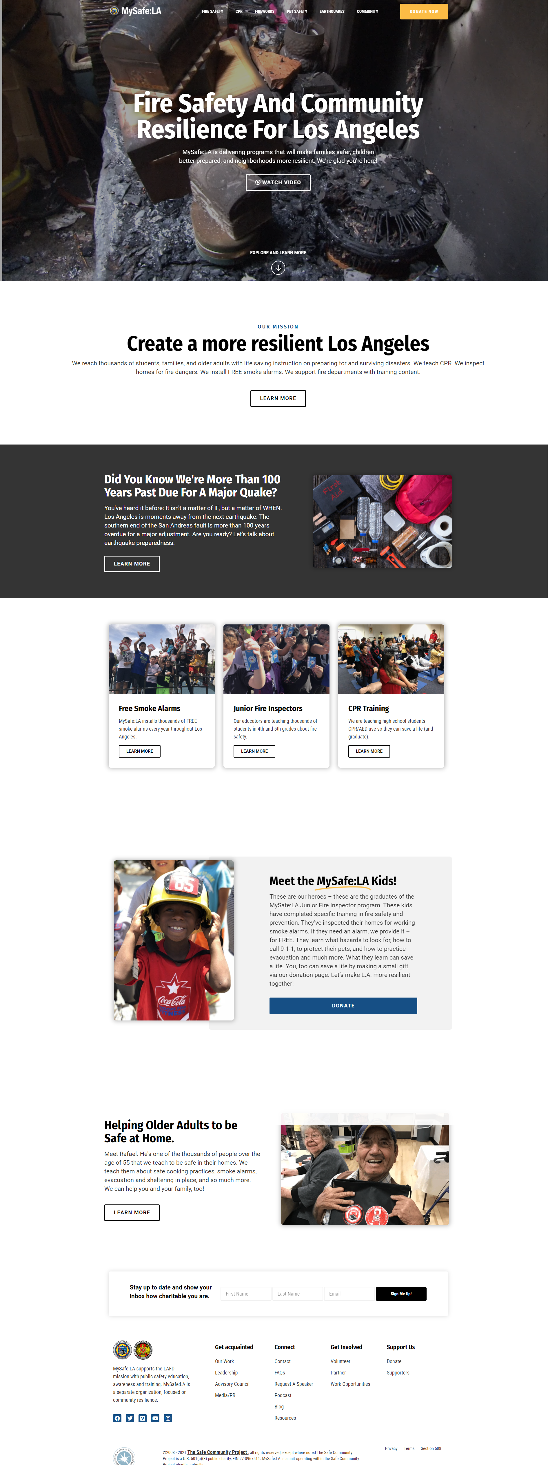
The mission and ‘why’ of the organization is front and center as soon as you view the home page. They exist to educate the public on safety—and the website exudes this. The main navigation outlines a variety of educational materials grouped into specific content categories. The use of static imagery and video showcasing members of the community (and MySafe:LA team members) provide site visitors with content that resonates with them—they can see themselves here.
Tips you can use:
- Skip stock photography; use imagery from your team and surrounding community
- Make your donate button loud and proud in the navigation area of your site
- Group content into key categories that are helpful to site visitors
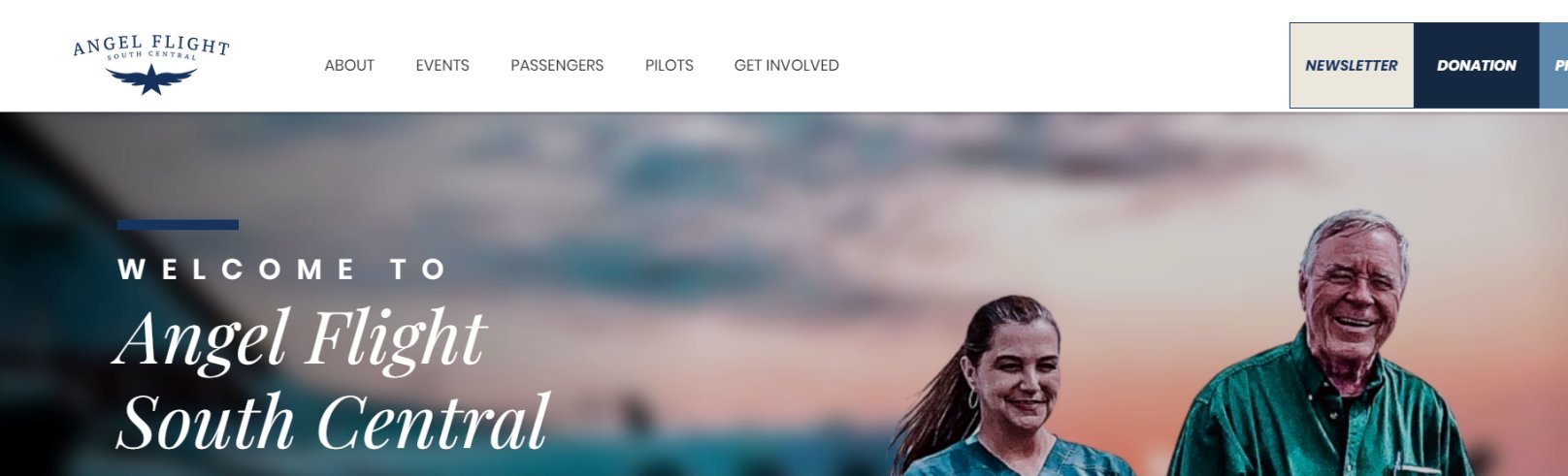
Angel Flight South Central

We love the big, bold buttons that indicate clear calls to action, leading visitors to major areas of the site—flight requests, donations, newsletter. Angel Flight South Central also uses a chat feature giving users the opportunity to talk in real-time or ask questions via email that may be answered later. It’s clear what areas of the country this nonprofit serves and there are five different ways to get involved listed plainly as part of the main navigation on the site.
Tips you can use:
- Big and bold: Make your calls-to-action stand out above the rest on each page
- Be available in real-time: Consider live chat or delayed chat options
- Provide options: Showcase all the ways someone can get involved with your organization outside of donating
Amazon Conversation Team
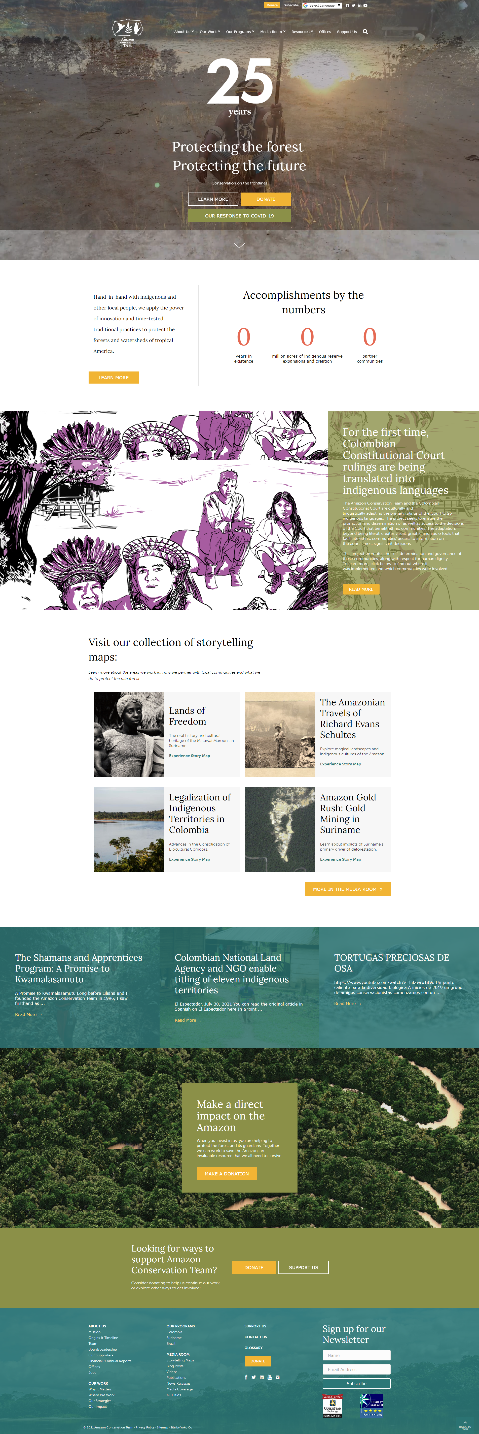
This nonprofit does a great job of storytelling through images, video and individual stories. The site acts as a great resource for the media and they are clear about the work they do and why it matters. The imagery pulls us in, providing us with curiosity and intrigue.
Tips you can use:
- Showcase your numbers and accomplishments on your home page
- Highlight stories of impact
- Provide resources for the media—you never know who might want to pick up your story
Boston Trinity Academy
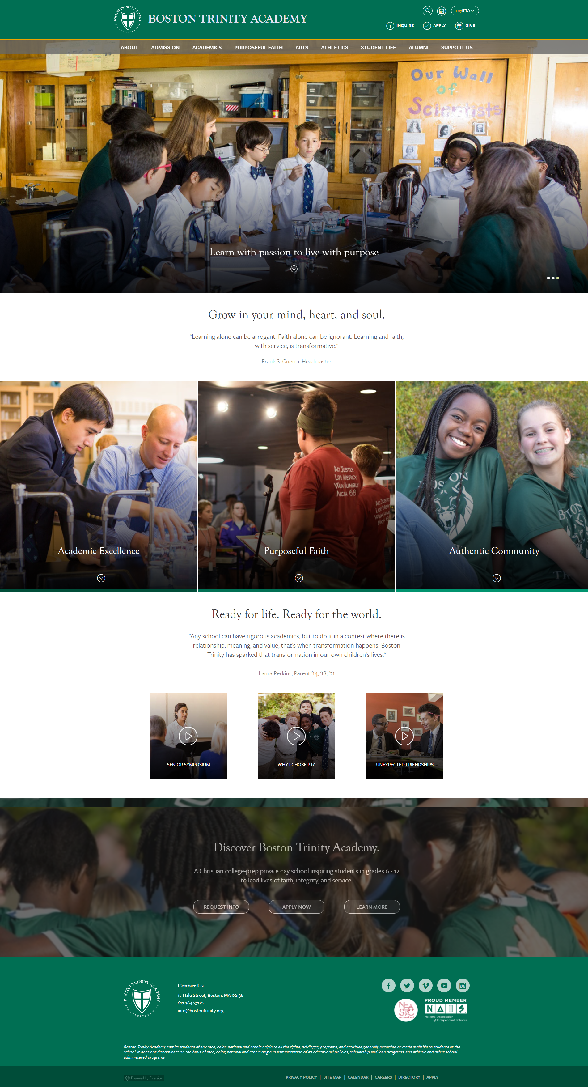
This educational institution website does a great job of organizing a lot of different content with an easy user interface. The tenets of the school are front and center—academics, faith and community—and continue to resonate through all messaging on the site. The background video that auto-plays in the hero area (top of the site) showcases a variety of departments, activities and learning opportunities at the school.
Tips you can use:
- Design your site for all user types; think about who will come to your website and what types of information they may be looking for
- Put your purpose, your values and/or your mission statement front and center
- Provide multiple ways to get more information or ask questions. Use links like, ‘request info,’ ‘learn more,’ ‘get involved,’ or ‘donate’.
Cystinosis Research Foundation
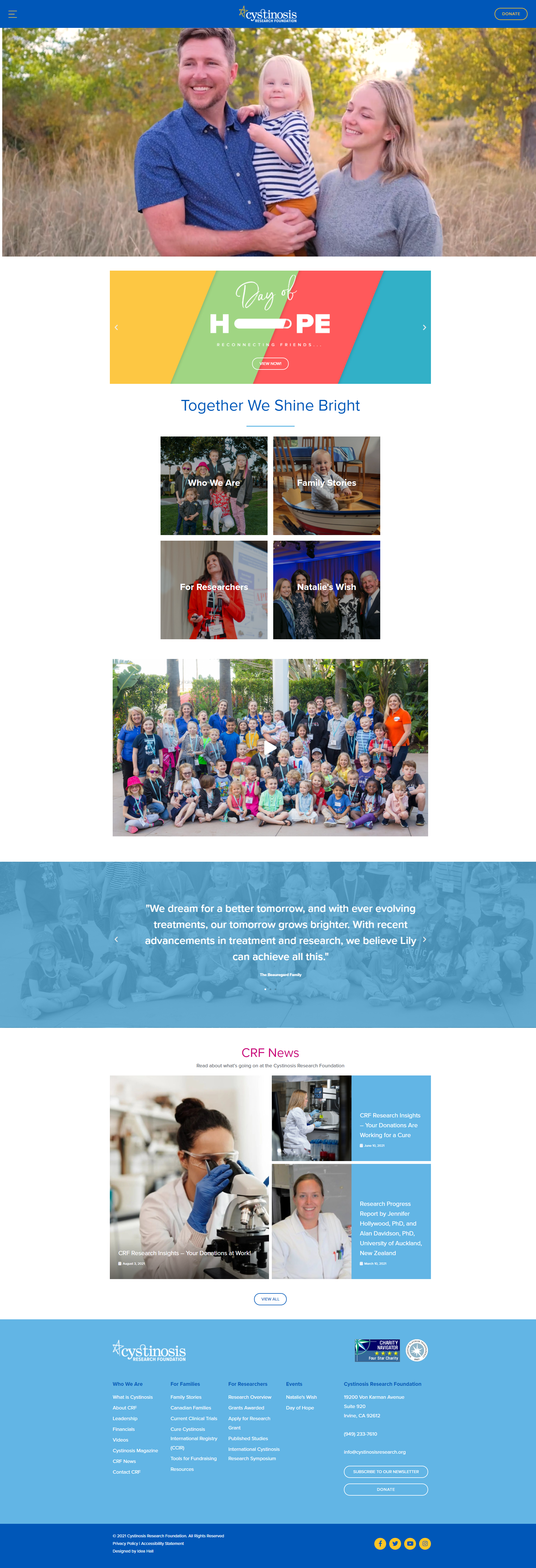
This is another site that caters the navigation to various audiences—families and researchers—providing extensive resources for each group. The straightforward “who we are” section speaks well to donors who might be looking to learn more about who they might invest in. We love the accessibility menu that is built into this site (powered by UserWay.org) found on the bottom right corner. This site is also optimized for use on any size screen—a must!
Tips you can use:
- Optimize for mobile. Ensure your site can be viewed easily on desktops, laptops, tablets and smartphones.
- Be accessible. Can your site be enjoyed by those with limited visibility or hearing? Do you have options for changing contracts, text size, pausing animations or having content read to you?
- Use testimonials to create trust. Cystinosis Research Foundation uses testimonials from families impacted by the nonprofit’s work
There are many 4aGoodCause clients with great websites to learn from. Use these as a starting point to assess your website and think about how you might use elements such as video, pictures, mobile-friendly programming, accessibility and stories of impact to take your website from good to great!